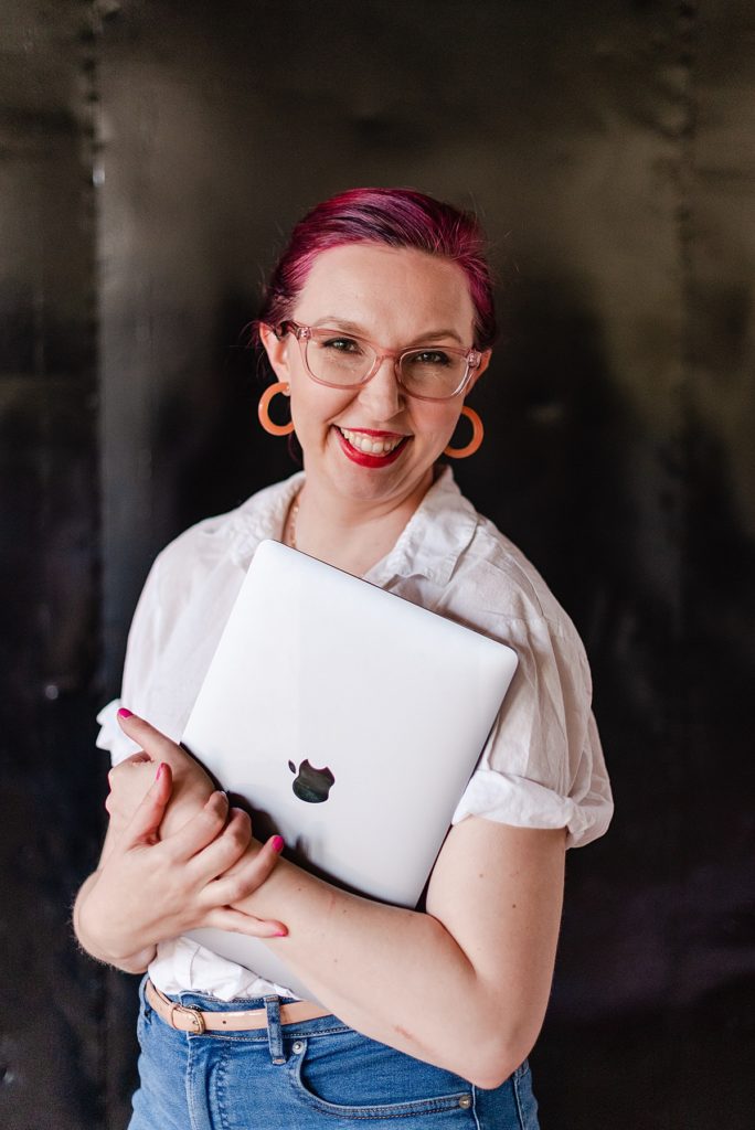
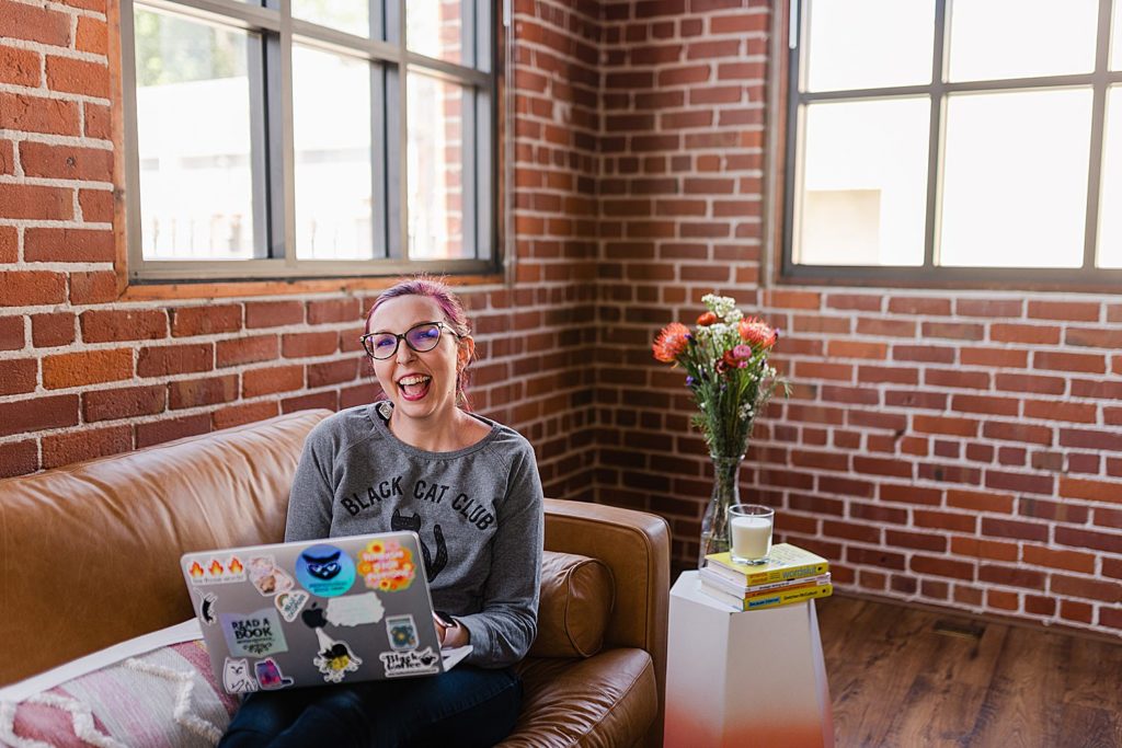
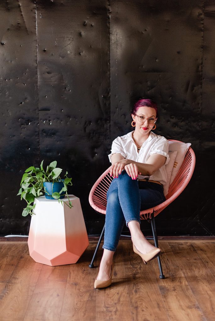
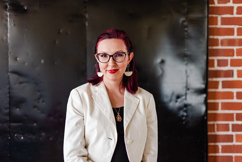
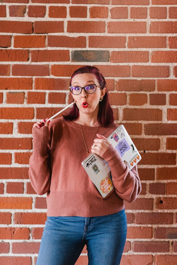
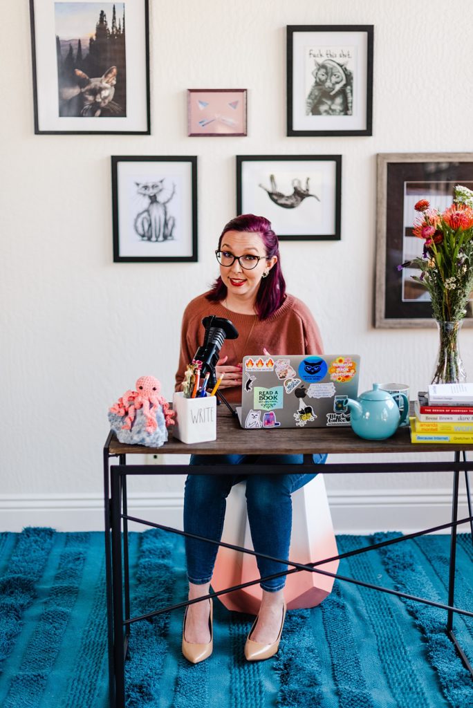
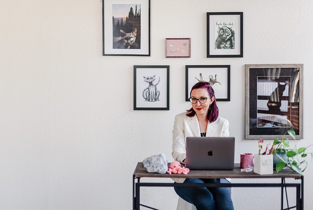
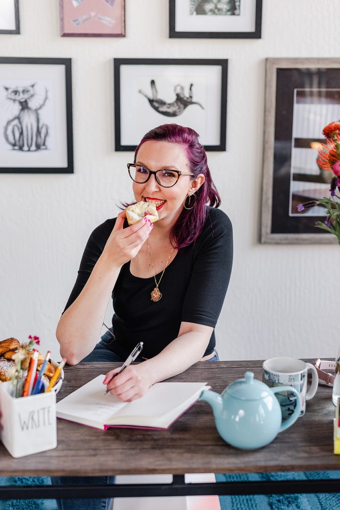
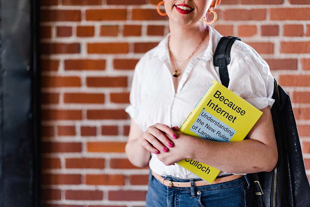
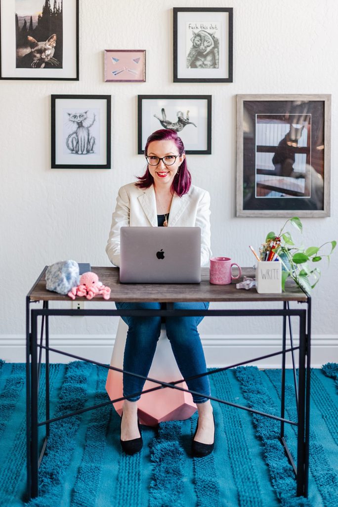
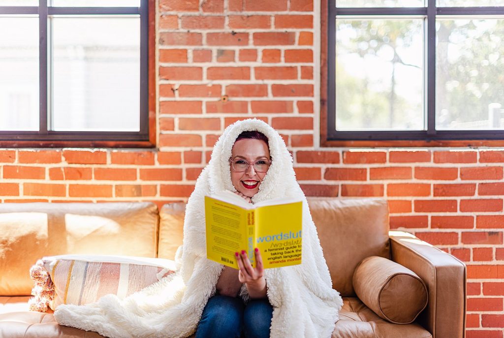
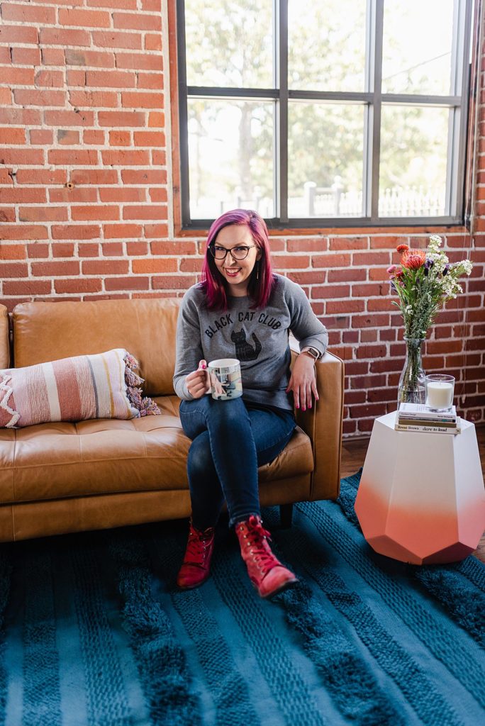
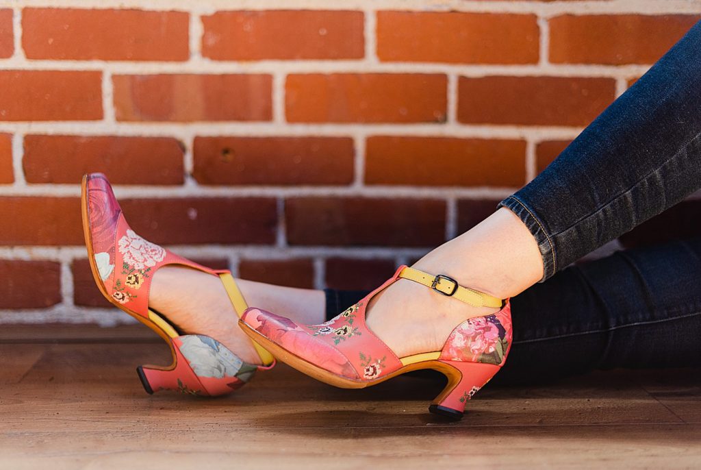
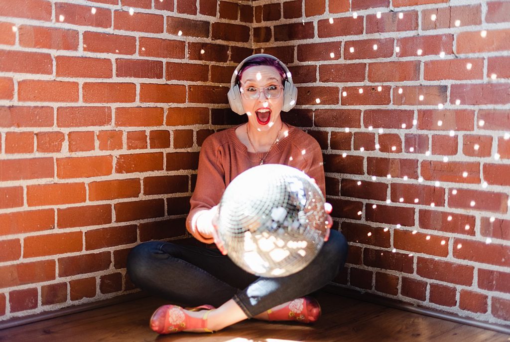
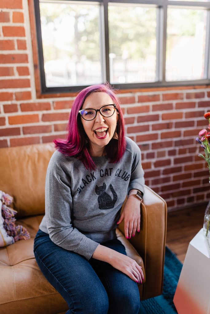
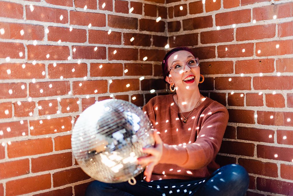
When I say that I’m obsessed with Katherine’s copywriter brand photos, I MEAN IT! 📢
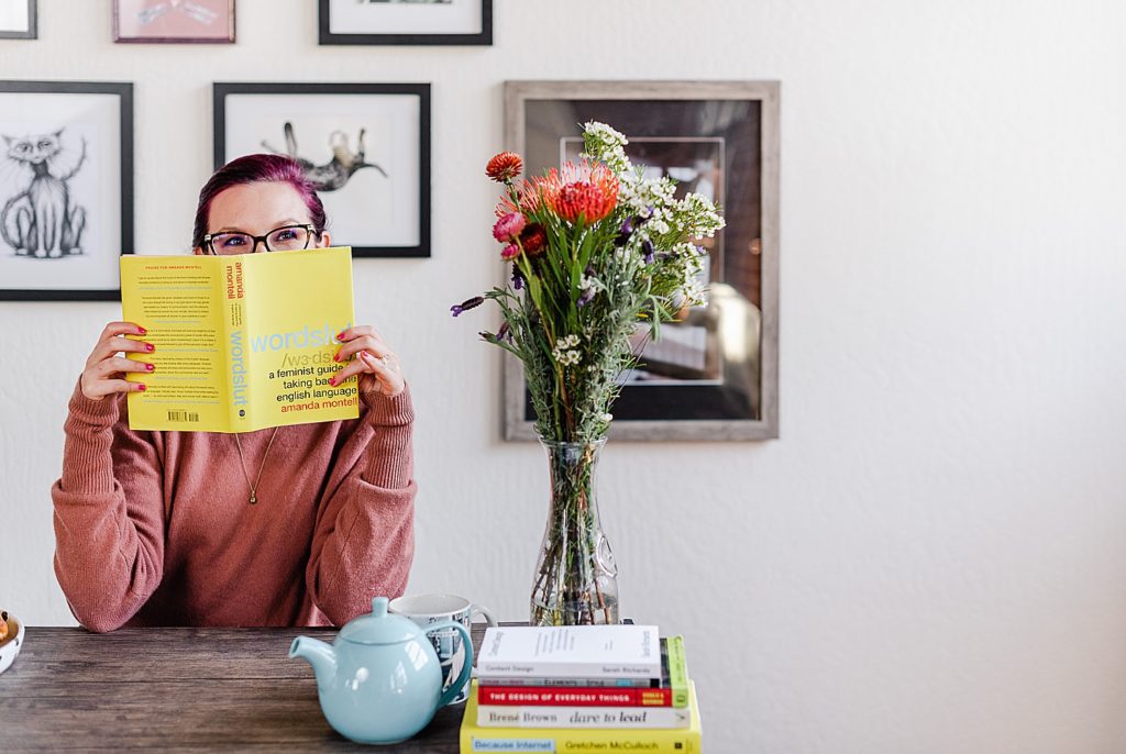
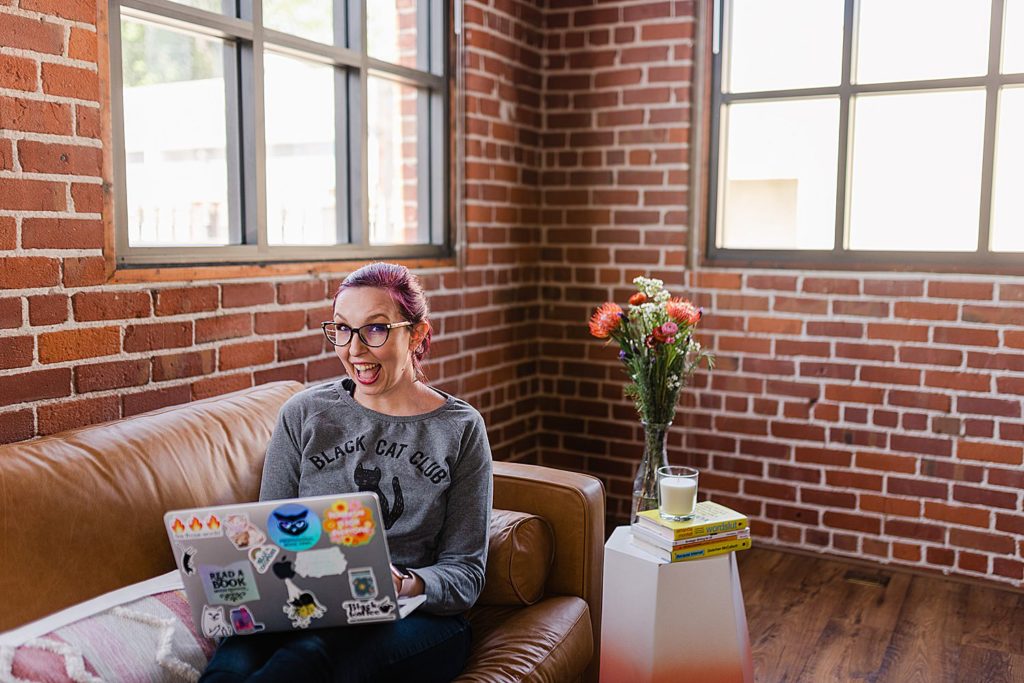
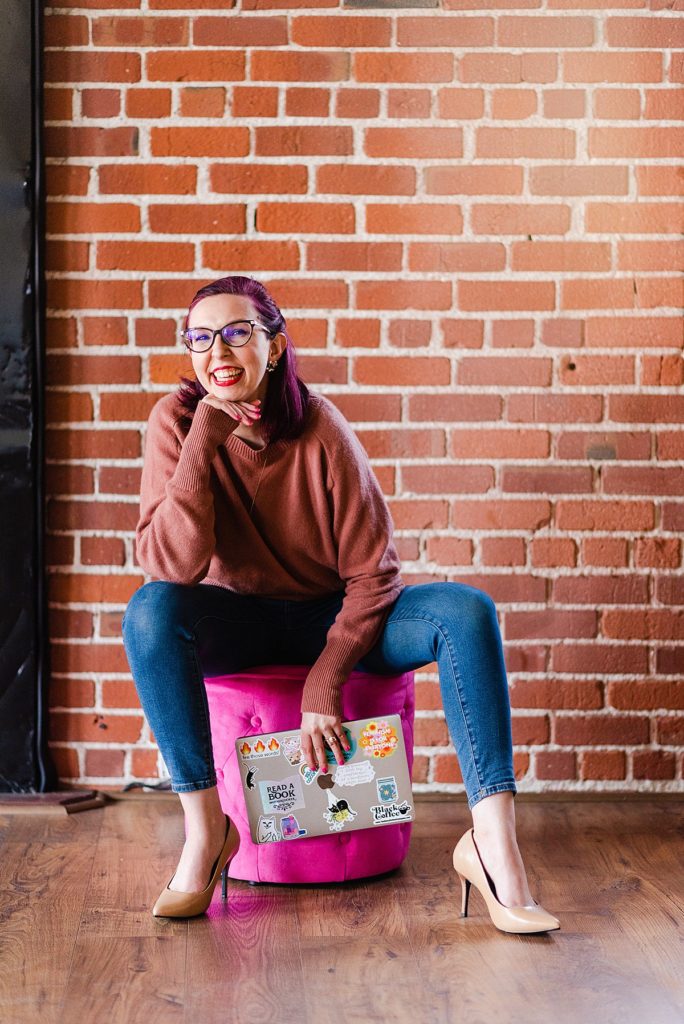
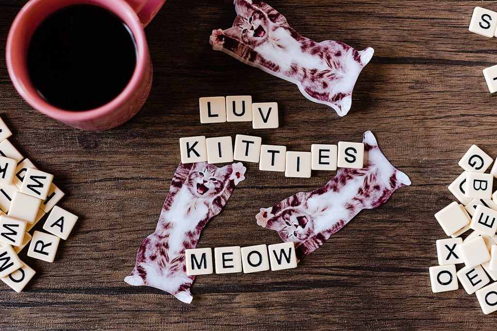
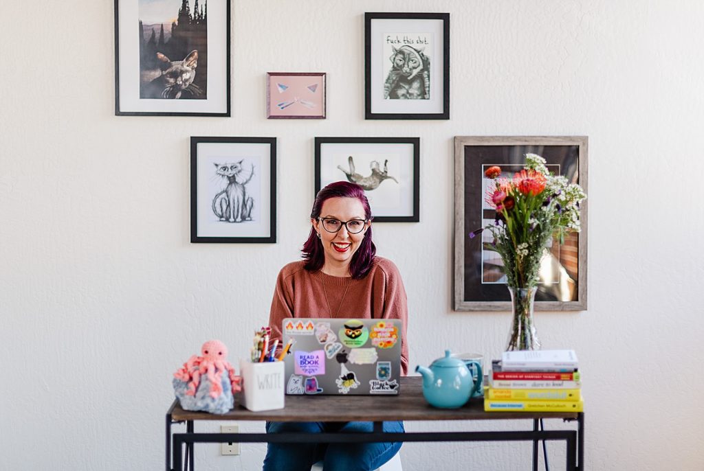
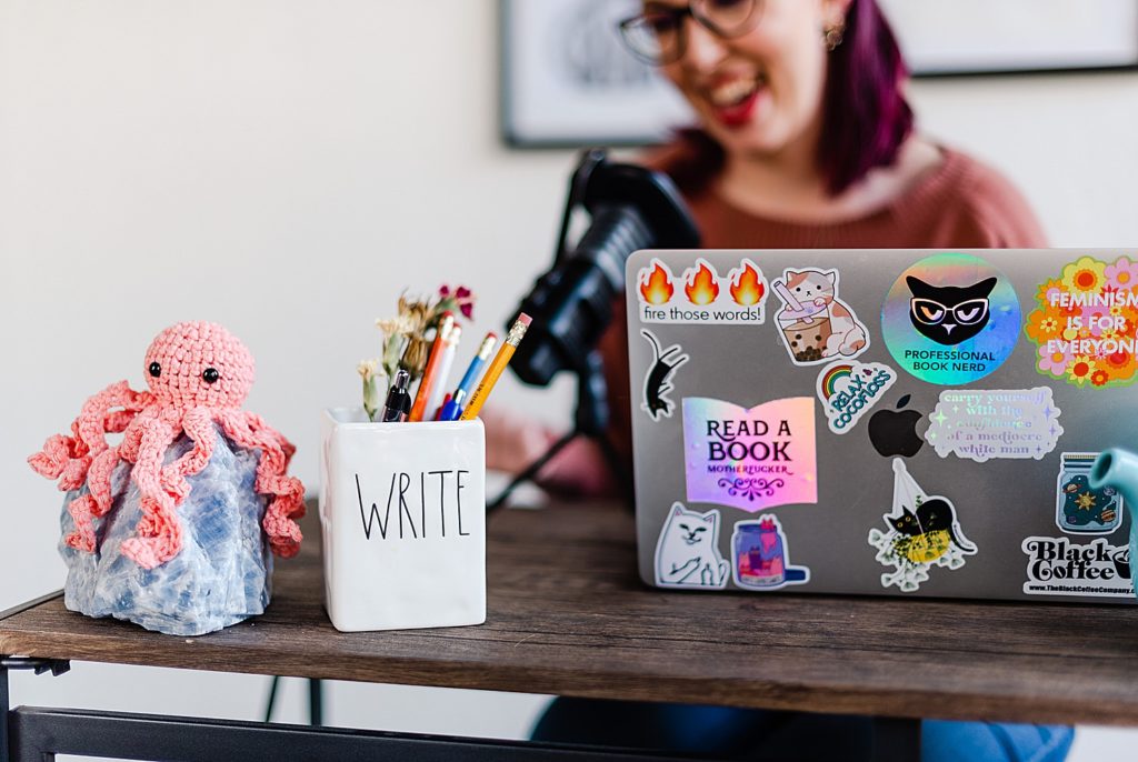
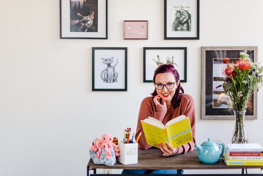
I mean, just look. Katherine’s whole vibe, the scenes we set up at Little Sunday Studio, her love for cats, everything is just 🤌🏼
Katherine is a content strategist and copywriter at Squarespace. She also mentors UX writers who are new to the industry, and she has a podcast!
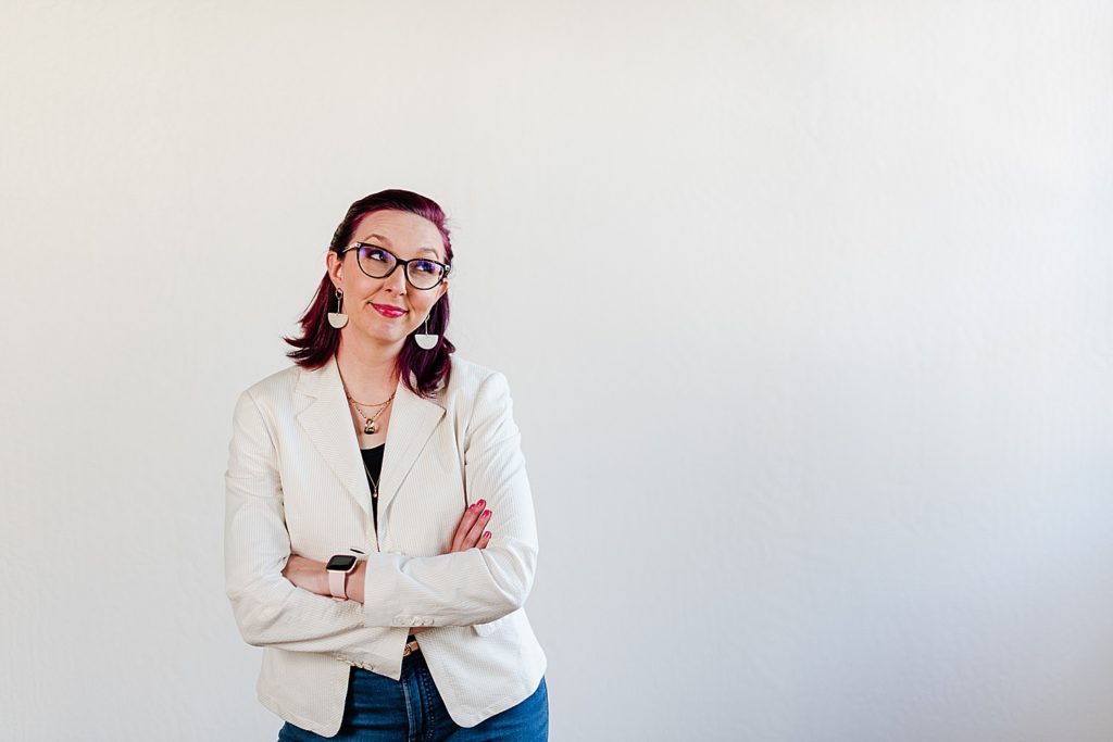
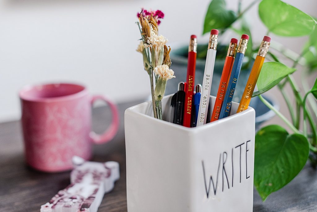
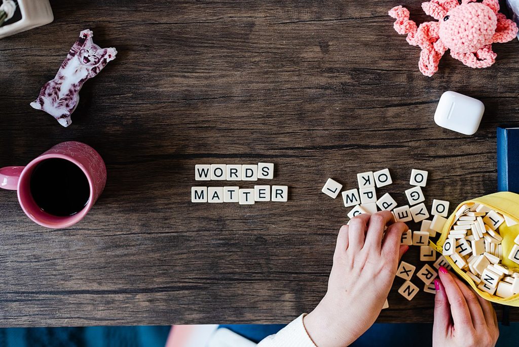
She reached out to me to help her with brand photos for her new website. With website redesigns, it’s important to create a variety of compositions so that they’re easy to sprinkle photos throughout different pages. With her new website redesign and background as a copywriter in mind, we planned out some amazing and creative photography setups.
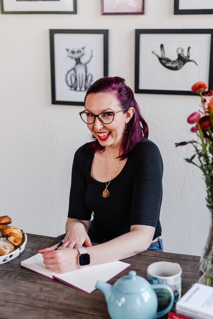
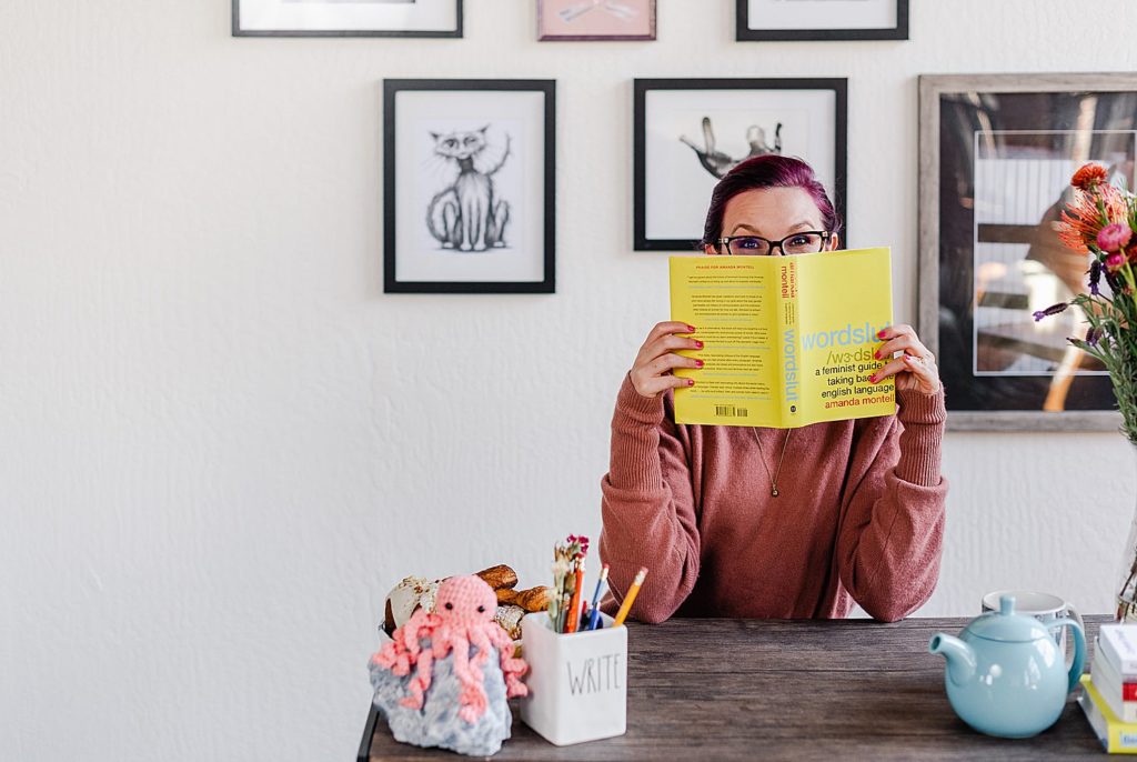
At Little Sunday Studio, we set up a few different backdrops for her copywriter brand photos. My favorite might be the gallery wall of cat art that we put together. I love when people bring elements from their own home, and Katherine brought so many!
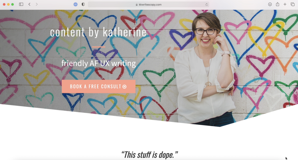
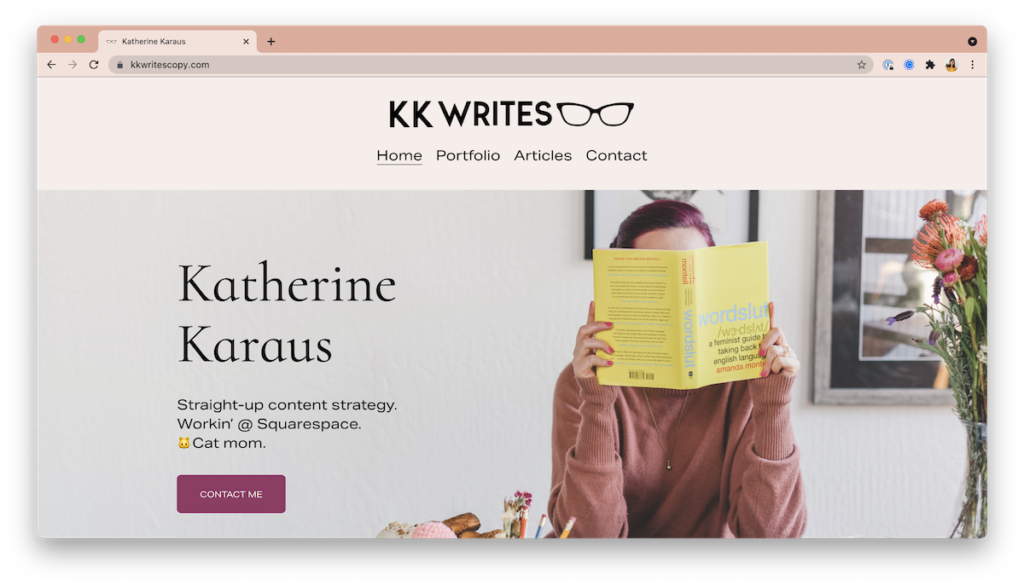
Below, I’ve attached some screenshots of her old website and her new one. Website redesigns are some of my favorite projects because it’s so fun to see the before and afters!
Old Website


New website with our brand photos


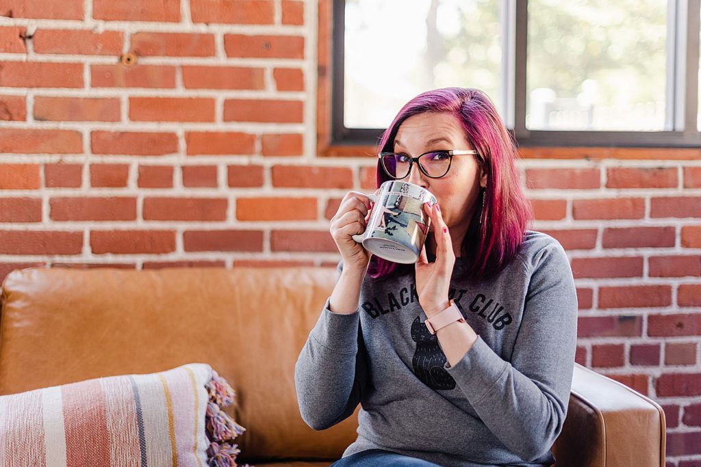
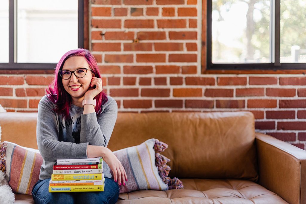
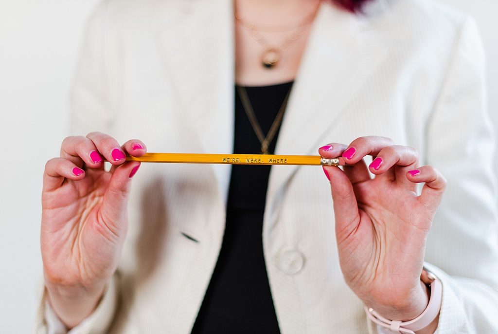
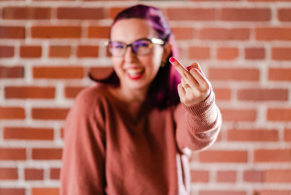
Here are just a few of my favorite images from her session. Her website is live now with the photos we created together!




Be the first to comment