As the owner of a product brand, you have a plethora of products to show off, and likely a good amount of beautiful imagery to do so. So how on earth are you supposed to choose which photos to use on your website home page?!
For your product brand, the issue of choosing the right photos for your home page might not lie in not having enough photos to use, but instead in having too many. The options are likely endless, and all of your products are equally special and different, right?
Well, as your resident brand and product photographer, I’m here to share 4 website photo ideas for you to use on your home page!
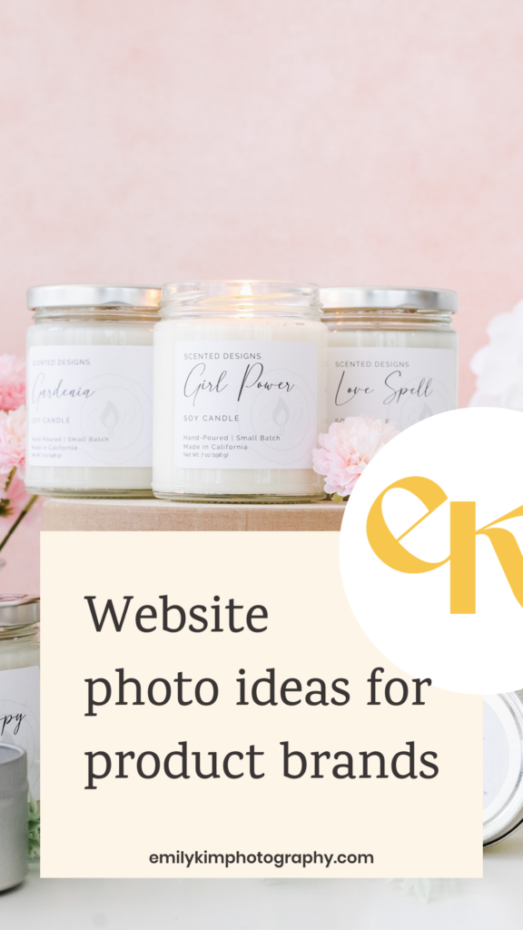
Website photo ideas for product brands
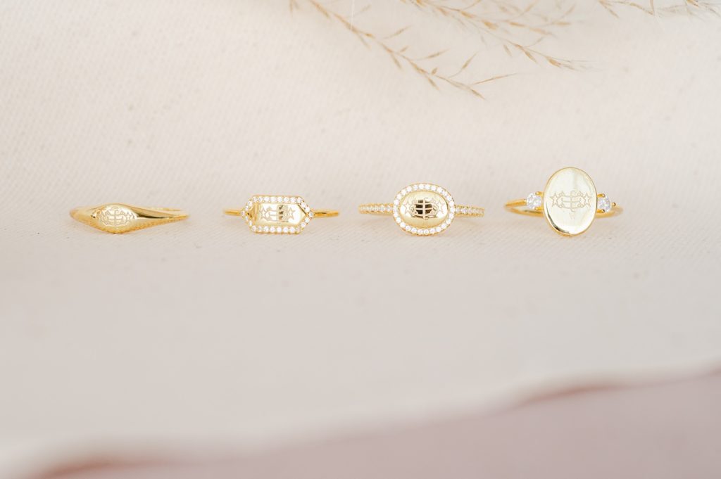
1. A photo of your best-selling product or piece
Take a moment to review your entire product line up, and try to pinpoint your standout products that have surpassed others in sales. Do one or two stand out? If so, you’ll want to use a photo of those product(s) on your home page, preferably above the fold.
2. A photo of seasonal items
Many times, you’ll find that you have a seasonal collection or item to show off – which means you’ll definitely want to have a dedicated photo or stop motion (GIF) on your home page, sitting above the fold! Never be scared to change things up on your site for seasonal drops. Google actually prefers when websites are regularly updated.

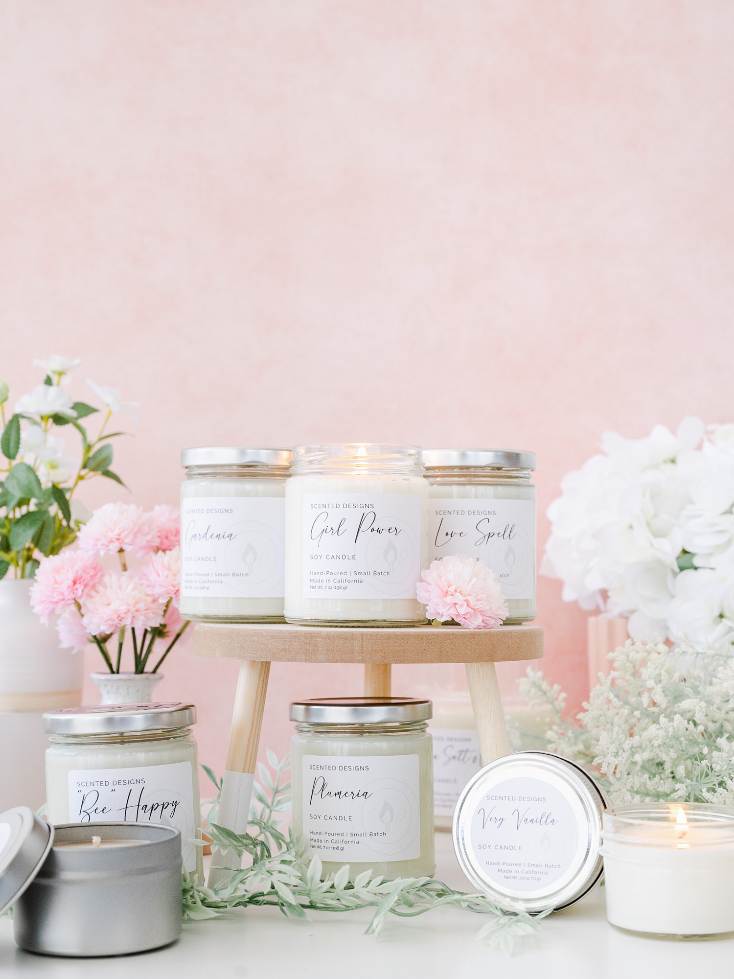
3. A group photo of your best-selling items
If you attempted to limit yourself to just one or two best-selling products and ended up failing, no problem – it happens all of the time! The truth is that your products are likely just *that good*, which means they all need to be featured or shown off on your home page! Have your brand or product photographer plan to style a group photo of your best-selling items – they’ll be able to make sure nothing feels too cluttered or chaotic.
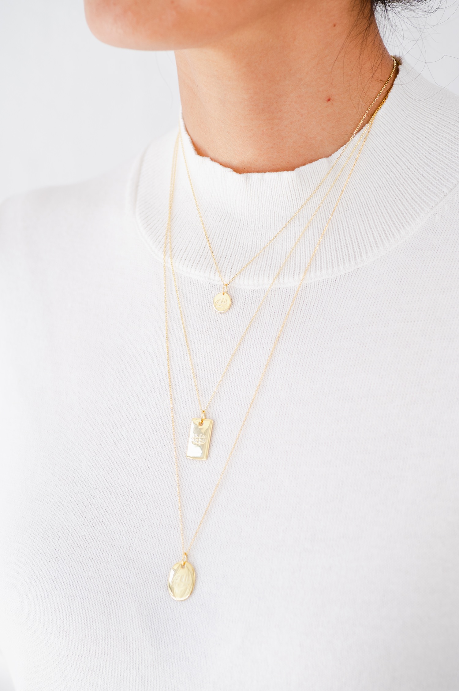
4. A photo of somebody using your product
As a brand photographer, this one might be my favorite! Show a photo of someone using or enjoying your product – whether it’s you, a model or a customer. The great thing about this strategy is that the people who visit your website will feel that there’s a bit more of a human element to your brand. It’s easy to get stuck in using the same imagery of products over and over again – so throwing in a photo of someone using your product is always fun!
Now, let’s discuss the star of your home page: your hero image!
Your hero image is the first image on your website, and it lands above the fold. This means that it’s the first photo that people see when they visit your website – so it needs to have the WOW factor!
I recommend choosing one of the image categories I shared in this blog for your hero image. From there, you can use the other image ideas I shared in other areas of your home page or website!
Bonus tip: Set your hero image as your social share image so that people see it when your website is shared to social media.
Are you ready to perfect your home page?
I could go on and on about photos just for your home page alone – but I’ll leave you to it. Before you go, make sure to check out my newest course: SEO for Creatives!
Increase your Google leads and website click throughs to turn them into real, paying clients.
I’m able to run my business with ease, confidence, and relaxation because I committed to my long-term SEO strategy. Are you ready to do that, too?
Click here to find out more about SEO for Creatives!
Save this to Pinterest
If you enjoyed this blog post, you might also like:

Be the first to comment