Woohoo! Your quarterly photoshoot is DONE and you have a huge library of photos to use for the next few months. But…where should you put them? There are so many photos here, and it’s overwhelming!
Instagram and social media always seems to be the default place to share your brand photos. You might be thinking, “am I really going to use all of these photos for Instagram? That’s over 100 posts to create! I only post to IG once or twice a week!”
Well, my friend, I’m here to tell you that you can and SHOULD be using your brand photos across your entire digital presence, not just Instagram. (Phew – I bet you didn’t want to write that many Instagram captions, anyway.) The best place to start is your home base on the internet – your website!
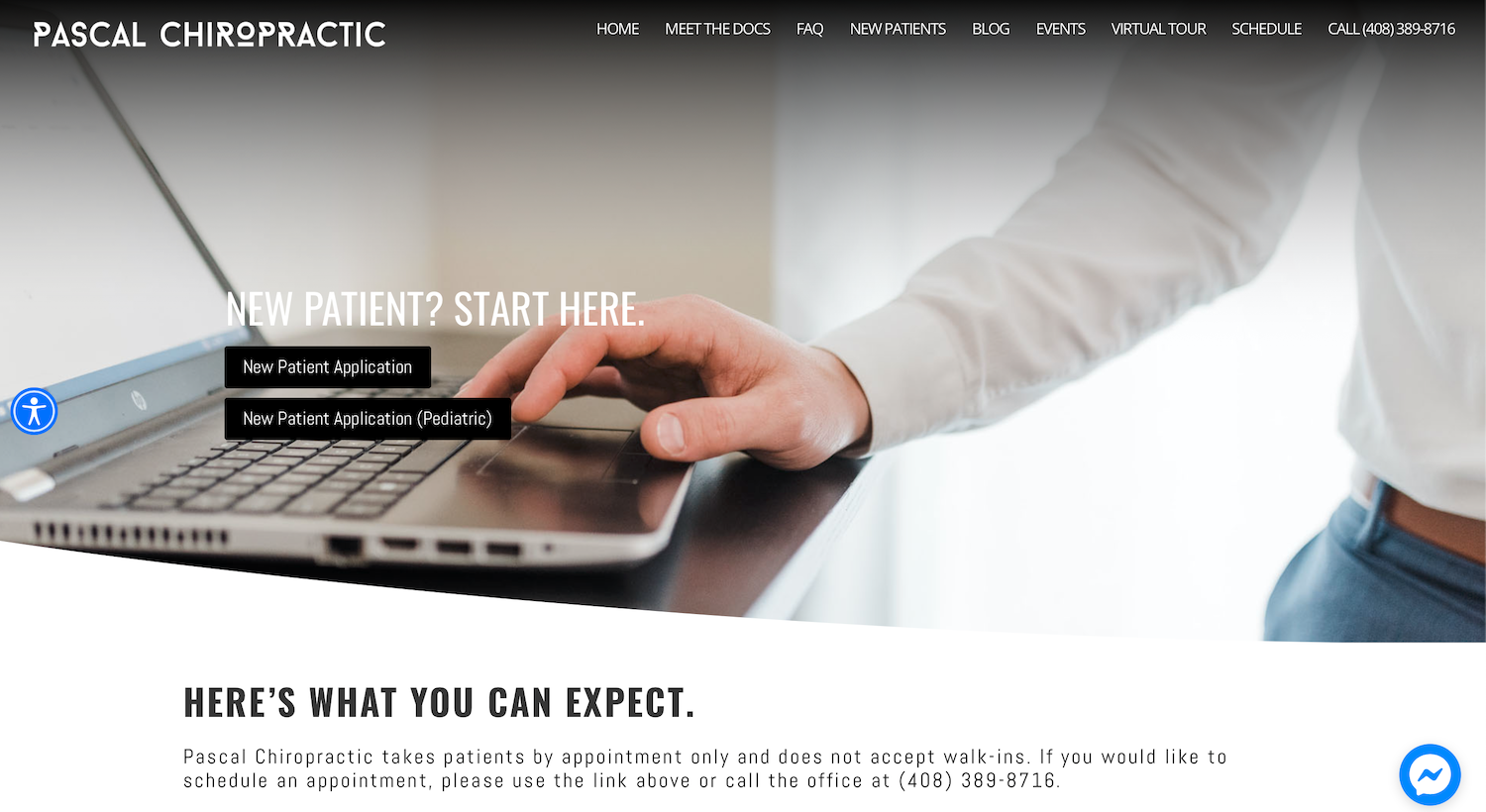
Without further ado, here are 5 places on your website where you should be using your brand photos. If you need a little inspiration, I’ve also included screenshots of some of my clients’ websites where they’ve used their own branding photos.

#1: Your “hero” image on your home page
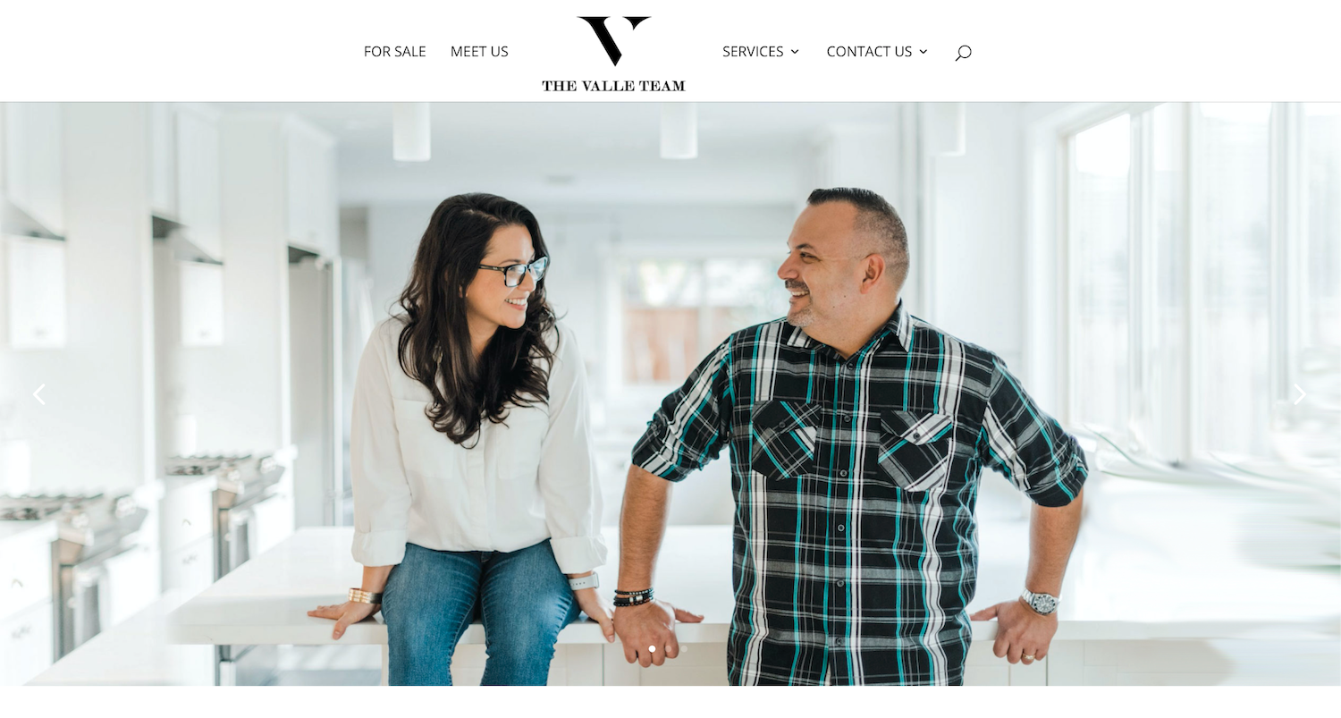
Seems like a no-brainer, right? This is the FIRST thing people see when they come to your website. Do you want their first impression to be of a generic stock photo?! No!
The first thing we want them to know is that you are special and that you bring something unique to the table.
Depending on your industry, the type of photo you can use here will vary. Here are a couple of ideas to get started:
- Coaching and 1:1 services: A photo of you working with a client or a personality photo of you
- Location-based services: A photo of your office
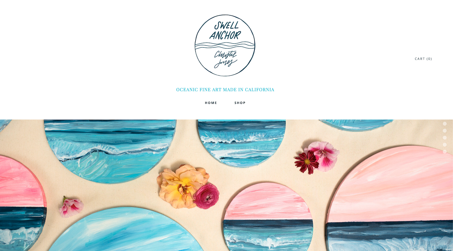
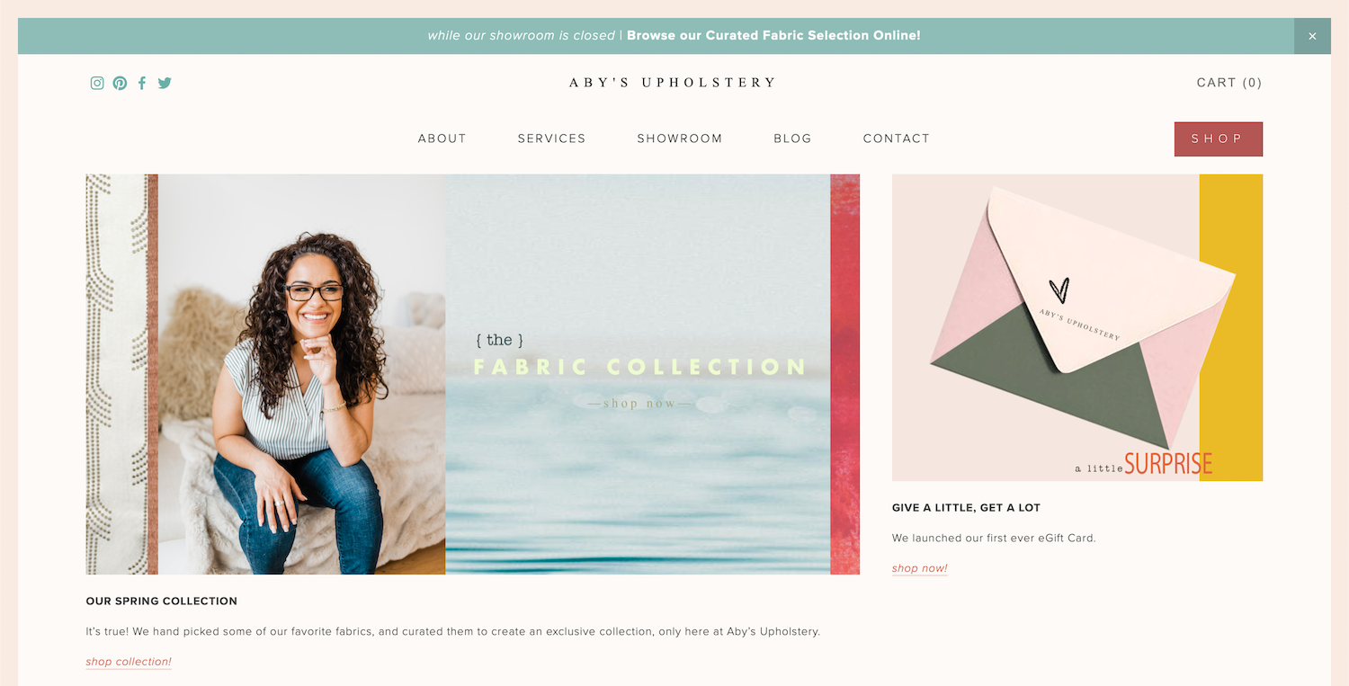
- Products: A photo of a collection of your products, or a behind-the-scenes photo of you creating your product
- Online and digital businesses: A photo of you with a laptop or computer or a photo of you working in your office

#2: Your offering page
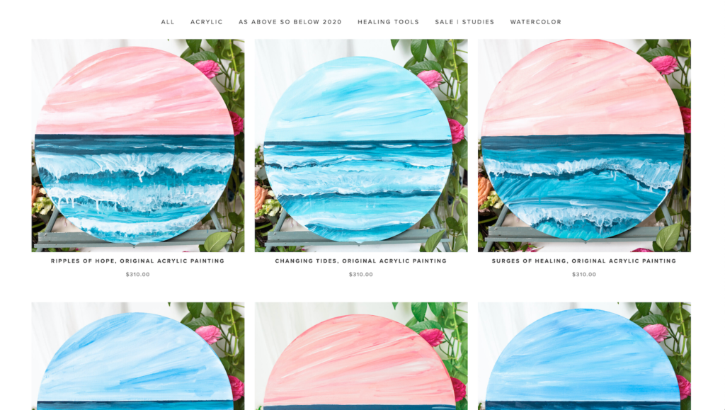
People want to buy from YOU, not some random website they stumbled across. Whether you run a product or service based business, you should include your custom branding photos here! This is not the place to use generic stock photos that blend into the crowd.
The types of photos you use here can be similar to what you display in your hero section on your home page. The key is, don’t use the same photo. If you had a photo of you working with a client on your home page, don’t include the same client on your offering page. This could lead your potential client or customer to believe that you’re just getting started or you have a small customer base.
That’s not what we want here – we want them to know and trust that YOU are the expert.
This is why you booked a brand photoshoot in the first place! You have a whole library of photos to pull from. Use a different client “model,” or show a different aspect of your business here.
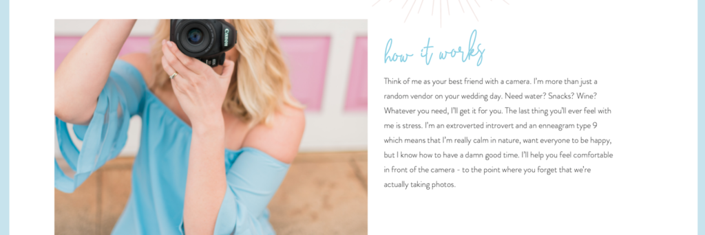
#3: Your about page

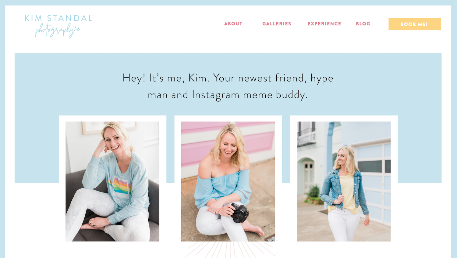
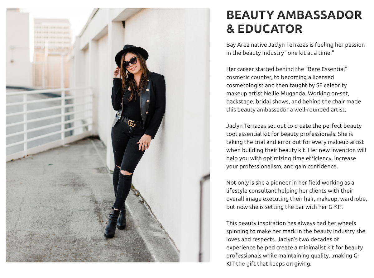
Alright, this one is pretty self explanatory. This page is about you, so make sure to include a photo of you! I recommend adding a couple:
- A headshot of you. Make sure you are looking at the camera, no sunglasses, and choose a photo taken from the waist-up. This really allows your viewer to connect with you.
- A photo of you working. This establishes your authority.
- A fun photo of you. The sky is the limit on this one! It doesn’t have to be waist up, it can be full body or a wide shot. Do you like wine? Throw in a photo of you drinking wine. Have a dog? Add a photo of you with your pup.


#4: Your blog
If you regularly write blog posts, this is a super great place to use your branding photos. If you’re writing an informational post, sprinkle your “b-roll” photos (detail shots, close ups, pictures where you aren’t the focus) throughout the post.
If it’s an interview blog post, throw a headshot of you and a short bio at the bottom so people can get to know you as the host.
Bonus: If you use Pinterest, use your brand photos to create pin images and graphics.
#5: Your contact page
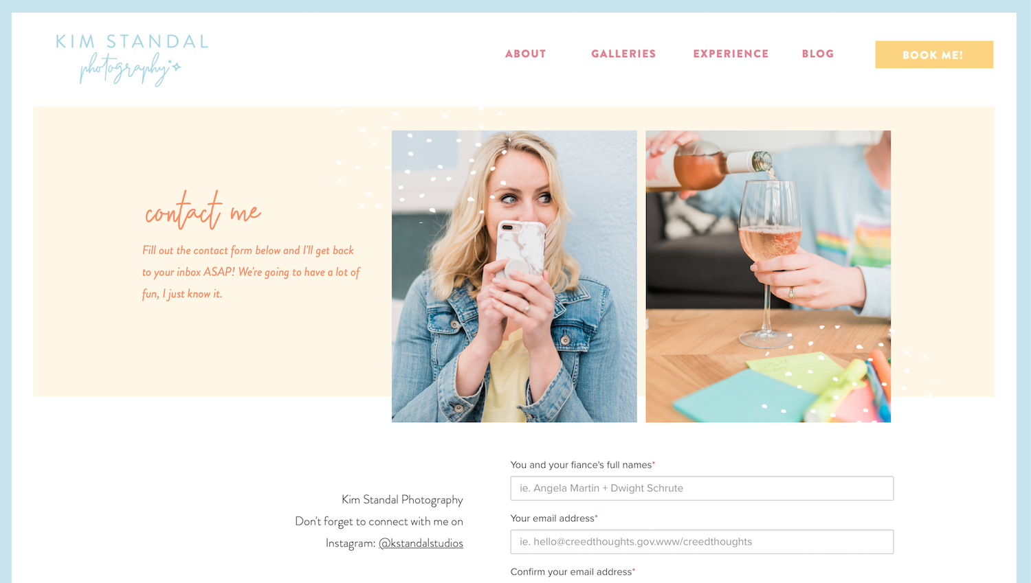
Congrats, you’ve got a warm lead! Your website viewer has browsed your whole website, seen all of the beautiful photos of you and your work sprinkled throughout, and now they’re ready to get in touch.
Let’s go ahead and throw your face on this page so that people can connect with you while they’re filling out your contact form.
It’s almost like you’re there, watching them, as they type this message to you. But it’s not creepy, I promise.
For this photo, make sure it’s another one where you’re looking at the camera. Ideally, use a waist-up photo here, too.

Wrapping up
Alright folks, those are my top 5 recommendations for places on your website where you should be using your branding photos. If you are still in need of branding photos, get in touch with me.
Have any more suggestions that I missed? Drop them in the comments below! 👇


Be the first to comment